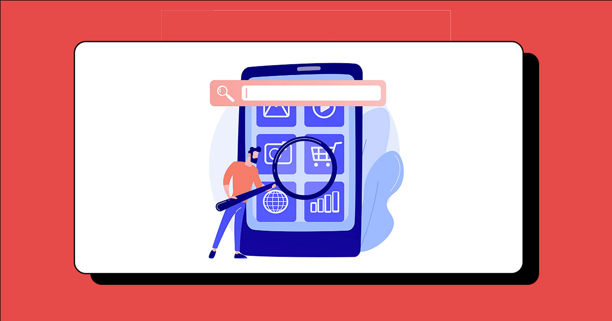
Mobile SEO: 9 Essential Best Practices And Tools
Mobile SEO is a crucial factor for user experience and for ranking on Google because of mobile-first indexing. And did you know that at least 87% of mobile owners use a search engine daily (Backlinko) whilst, mobile search is responsible for 58.99% of all website traffic worldwide.? (Statista).
If you want to increase organic traffic and returning users, then providing a good user experience is essential. Hence, developing a mobile-friendly website is crucial for the success of your website.
In this article, find out what is mobile SEO and how to optimize your website to be mobile-friendly.
Table of Contents:
- What is Mobile SEO?
- How to conduct a mobile SEO audit?
- Best Practices for Mobile SEO
- Key Takeaways
What is Mobile SEO?
Mobile SEO is the process of optimizing a website for mobile devices.
This form of SEO ensures that a website is responsive and well-optimized for the user’s device, as well as optimized for mobile search engines. It includes creating mobile-friendly navigation, optimizing title tags and meta descriptions, creating a separate mobile URL, creating mobile content, and more.
Before we dive into mobile SEO best practices, let's learn how to view your website performance on mobile devices.
How to Conduct a mobile SEO audit?
Google considers page experience for Google SERP rankings. The speed at which your page loads is also part of the page experience.
That's why, Google advises that mobile websites load in less than two seconds. Fortunately, Google offers tools to review where your website stands and optimization suggestions.
To learn the performance of your website on mobile and the issues, you can use these free Google tools.
01. Google Search Console (GSC)
With GSC, you can view your mobile performance in two ways.
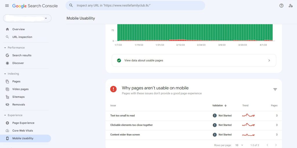
01. First way is to Sign in to GSC and select "Mobile Usability" under Experience.
Here you can view mobile issues such as when a page's content is too small or when interactive elements are too cluttered.
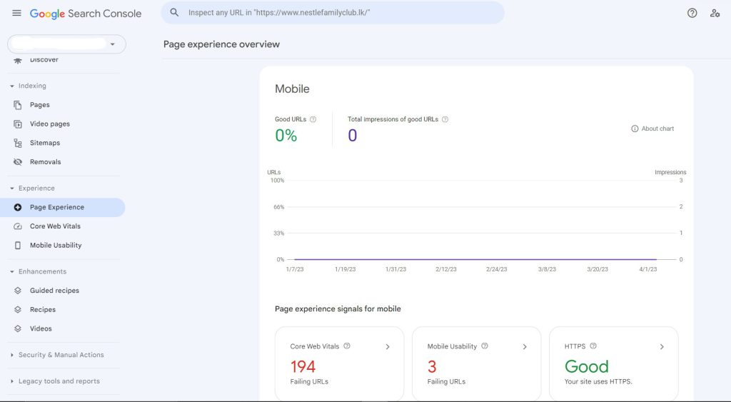
02. You can also view the overall mobile performance in GSC > Page Experience. Simple and easy as that.
02. Mobile-Friendly Test
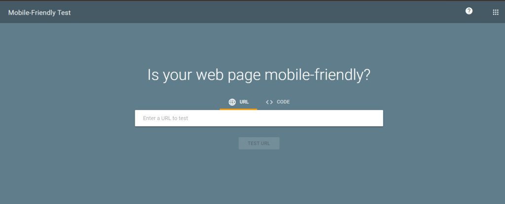
Another way is Google's Mobile-Friendly Test tool. You can use this tool to assess mobile-friendly features of any web page.
With this tool, you can simply paste your website into the tool without logging in. If the link you entered is mobile-friendly, you will then be informed. Or else, it will inform you of the issues you need to address.
Hover over a topic to see a question mark if you want to learn more about it.
03. PageSpeed Insights
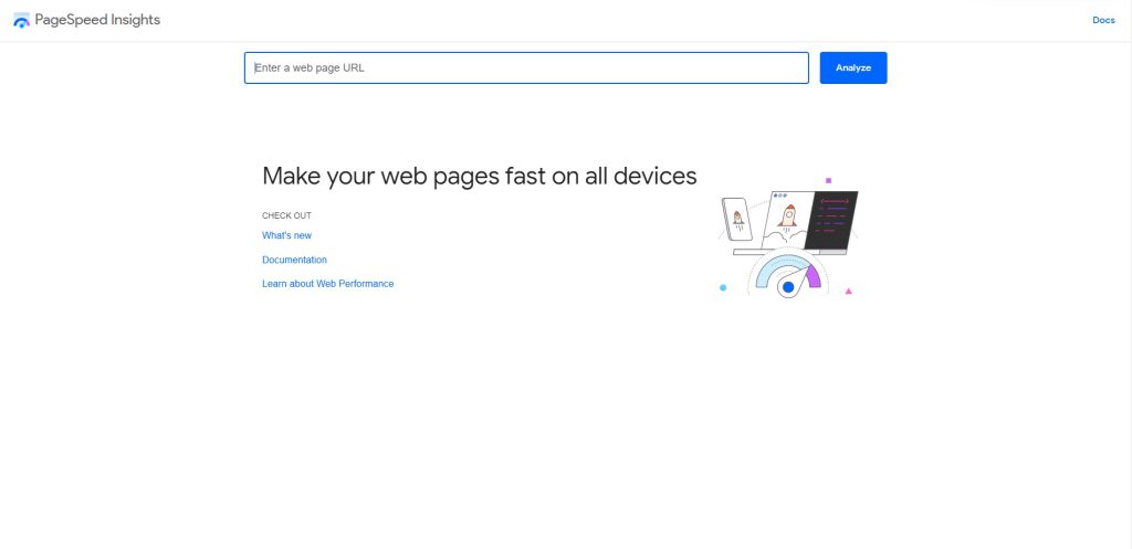
This tool is one of the top tools which generates all the issues and plausible solutions.
PageSpeed Insights will evaluate your Core Web Vitals, a collection of elements that impact the user experience on a website.
Creating a mobile-friendly website is essential for achieving success with mobile SEO. Following best practices will ensure that your website looks great and functions properly on both desktop and mobile devices, while also optimizing it for search engines. Here are some of the best practices to follow:
Best Practices for Mobile SEO
1. Responsive Web Design:

Responsive web design is the most recommended approach for creating a mobile-friendly website. This involves using a single website for all devices by coding the website to automatically adjust itself to fit different screen sizes.
Images and text will resize according to the device being used, making it easy for people browsing on phones or tablets to navigate your site. Additionally, there is only one URL involved, reducing the risk of search engine rankings getting split between two URLs.
Read More: 4 Types of SEO Services to Invest: Boost Organic Traffic 2023
2. Make Sure Your Site Loads Quickly:
Mobile users expect websites to load quickly and smoothly, so it’s important that you optimize your site accordingly.
This includes compressing images, minifying code, and using browser caching whenever possible in order to reduce page load time and ensure a better user experience overall.
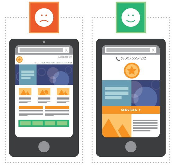
3. Optimize Title Tags and Meta Descriptions:

The above screenshots indicate two examples of good meta titles and meta descriptions.
They are brief and straight to the point.
Title tags provide a concise summary of your page's content. They appear as clickable links in search engine results and should include keywords related to the topic of your page.
Title tags are an important factor when it comes to SEO-friendly web pages, so make sure to craft them carefully.
Meta descriptions help users understand what the content of the page is about before they actually visit it. It’s important to create meta descriptions that accurately summarize the content on a page while also including relevant keywords to improve ranking in search engine results.
When writing meta descriptions, make sure they're unique, no longer than 150–160 characters, and that they include both brand-specific phrases and relevant keywords.
4. Optimize Your Content For Mobile Devices:
Creating content optimized for mobile devices is key when it comes to driving traffic from organic searches on phones or tablets. This means keeping paragraphs short and adding interactive elements like clickable buttons which make it easy for users to browse your site from their mobile devices.
Moreover, including photos and videos can help keep visitors engaged with your content, as well as increase time spent on-site which is seen favorably by search engines like Google & Bing.
5. Incorporate Image Optimization Tools
Images can take up a lot of space when loading pages on a smartphone or tablet. Hence, it’s important that you optimize them in order for your pages to load quickly and properly across all devices.
There are various tools available online that can help you compress images without losing quality - so when updating content on your site, you can maintain optimal performance across all devices.
For example, TinyPNG, Kraken.io, Compressor.io, Optimizilla, EWWW Image optimizer are some of the popular image optimization tools.

You can further follow these steps to optimize images.
- Use image formats such as WEBP or JPEG
- Resize images to 1000x500 which is large enough to display on any device.
- Choose lossy compression or lossless compression. Lossy compression detects and removes superfluous pixels within an image, whereas lossless compression reorganizes data without impacting pixels.
Read More: B2B SEO Tools: How to Choose the Best One for Your Business?
6. Create a simple, easy-to-use navigation bar
The navigation of your website is critical for user experience. This is because the main menu or navigation is a key component used frequently by users. If users are dissatisfied with the navigation, they leave the site without returning.
So, it's essential to create mobile-friendly navigation to ensure you're creating a seamless experience for your audience.
Here's an example of the Hubspot Software Pricing page displayed on Mobile.
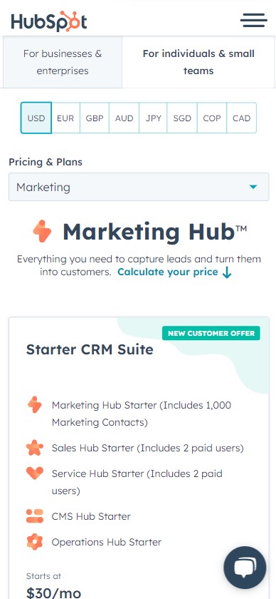
A hamburger menu as in the top right corner of this is the ideal approach to designing mobile-friendly navigation. This three-line hamburger menu appear at the top of a page. Your users will get a drop-down menu with all of the different websites that they can visit when they click on this button.
6. Mobile Redirects:

Sometimes, you might want to use separate URLs made for mobile users – Let's assume you want to create a unique user experience for users depending on their device category.
Then, you can redirect them from one URL over to another to direct users towards specific versions of your site depending on how they are accessing it (desktop vs mobile).
A mobile URL is usually "m.website.com" or "website.com/mobile." When users access your site via a mobile URL, they see a mobile-optimized version of your site. This modification allows users to interact with your website.
7. Avoid Pop-ups:

Pop-ups can be an effective way to draw your audience’s attention. However, when it comes to mobile devices, they can be frustrating which may lead users to abandon your page.
To ensure that pop-ups don't detract from your user experience, use them less, and make sure they are easy to dismiss by providing a clearly visible ‘x’ or ‘close’ button at the top of the popup window.
Further, consider using pop-ups only on pages where the pop-up has a significant impact - this will help keep your audience engaged without distracting from their overall experience.
8. Regular Mobile Website Audit:
It’s essential to regularly audit your website in order to identify any potential issues when it comes to mobile SEO.
This can include checking page load times, analyzing how content is displayed on different devices, and ensuring that all redirects are working properly.
Use the tools mentioned above and audit tools such as SEMrush, Screaming Frog, and Ahrefs to find your website issues and where improvements are necessary.
9. Optimize for Local Search:
Location-based searches account for 30% of all mobile searches. (Google)
Local SEO is an important component of mobile SEO. Mobile searches for the phrase "near me" have increased threefold in the last few years, indicating that consumers are increasingly looking for local companies.
To identify local businesses near them, people frequently use terms like "near me," "open now," and "where can I buy." Because so many individuals use local words when searching on mobile, you must alter your strategy for reaching them.
Local keywords might help you adapt to local searches. If someone searches for a local flower shop, they are likely to type in "flower shop in [city]." A local keyword such as "flower shop in Michigan" is a perfect example.
Using local keywords will increase your chances of appearing in local search results and is an excellent method for enhancing your mobile SEO strategy.
Key Takeaways
For a mobile-responsive website, you need to consider that the website is developed with a responsive design. Further, make sure that the website elements such as content, and meta tags are brief, concise, and easy to read.
Similarly, image compression, less irritable popups, mobile redirects, and feasible navigation can contribute to a faster loading speed which could result in a better user experience.
If you found this post helpful, share this with someone who would find it useful.
Reach out to us to get an insight into how we can help your website rank higher.
Read Next: 13 SEO Best Practices for B2B Companies (2023)